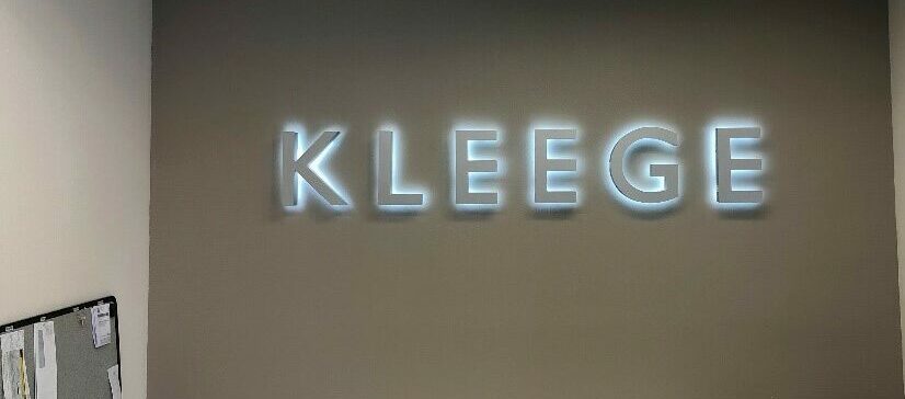
Struggling with corporate signage? Make sure to avoid the following mistakes.
Corporate signage is extremely important for any business in Miramar. However, if not used right, corporate signage often backfires. Unfortunately, most businesses spend a lot of money on corporate signs but end up making some terrible mistakes which do more harm than good. To make your life easier, we have put together a list of corporate signage mistakes you must avoid.
Let’s break it down.
Don’t Use The Wrong Fonts or Colors
It is rightly said that the first impression is the last impression. The same basic principle applies to your corporate signage. Consider yourself lucky if it delivers the punch. If not, then there are a few necessary adjustments you can’t afford to skimp on, because your customers base their buying decision upon what your sign offers them. To make sure whether or not your corporate signage represents your brand, you need to ask yourself an easy question: “Are the graphics, design, text, and color on my corporate signage relevant to my brand’s image?”
Simply put, your corporate signage should have the same color scheme, font, and graphics as your website, business cards, signboards, and similar marketing materials. By doing so, you will make your customers recognize your brand every time they come across your sign.
Also, you need to make sure that your signage is perfectly visible to the onlookers. The signage must also be perfectly readable and well-maintained. In case the sign is in bad shape, it will turn the customers away. Also, they will get the feeling that you don’t care for your signage, which will affect your reputation in the market.
Don’t Use Low-Quality Materials or Graphics
The internet is infested with company signs with typos and photographic flaws. These signs are fun to laugh at, but if you ignore these aspects, your customers might end up laughing at you too. Typos and poor imagery can make your signage confusing. Make sure to spend enough time proofreading the signs before they are published. This will help you keep your sign message vivid and less confusing. That said, with a professional sign company like ours by your side, you don’t have to do any proofreading yourself.
Apart from text, if your signs require images, make sure you incorporate those of higher resolution. This will make the pictures appear vivid and less blurry. The font size of the text should be perfectly proportional to the size of your corporate sign, and the font color should create a perfect contrast with the image colors. For high-quality business signs, make sure you contact a reputable sign company in Miramar.
Don’t Overlook Maintenance
LED and neon signs are the talk of the town when it comes to signage and serve as the perfect marketing tool. However, skimping on their routine maintenance can make them work against your business interests. A broken or flickering light is a major turn off for your clients, and makes them feel as if you don’t care for your signage.
To make your corporate signage stay relevant and appealing to your clients, make sure you avoid the mistakes mentioned above.


